
Share

In the age of digital revolution, where online advertising bombards us from all directions, traditional promotional methods still hold immense value. Promotional flyers are a reliable tool for reaching a wide audience, regardless of their age or technological preferences.
At Four Zeros, we understand that every business or personal brand has unique needs. That's why we offer flyer printing in five popular formats, each perfectly suited for customer service points, special events, or as handouts for passersby. Each flyer is crafted according to our clients' visions and expectations.
1. Standard Flyers (flat, 2-sided)
Minimalism and simplicity are key when conveying concise information in a compact format. Standard flyers are an excellent choice for companies looking to promote their products or services in a cost-effective yet impactful way. Ideal for trade shows, conferences, or industry events, these flyers allow you to present essential information on the front, such as the company logo, advertising slogan, and a brief description of the offer. The back can include contact details, operating hours, or a map to your store or office.
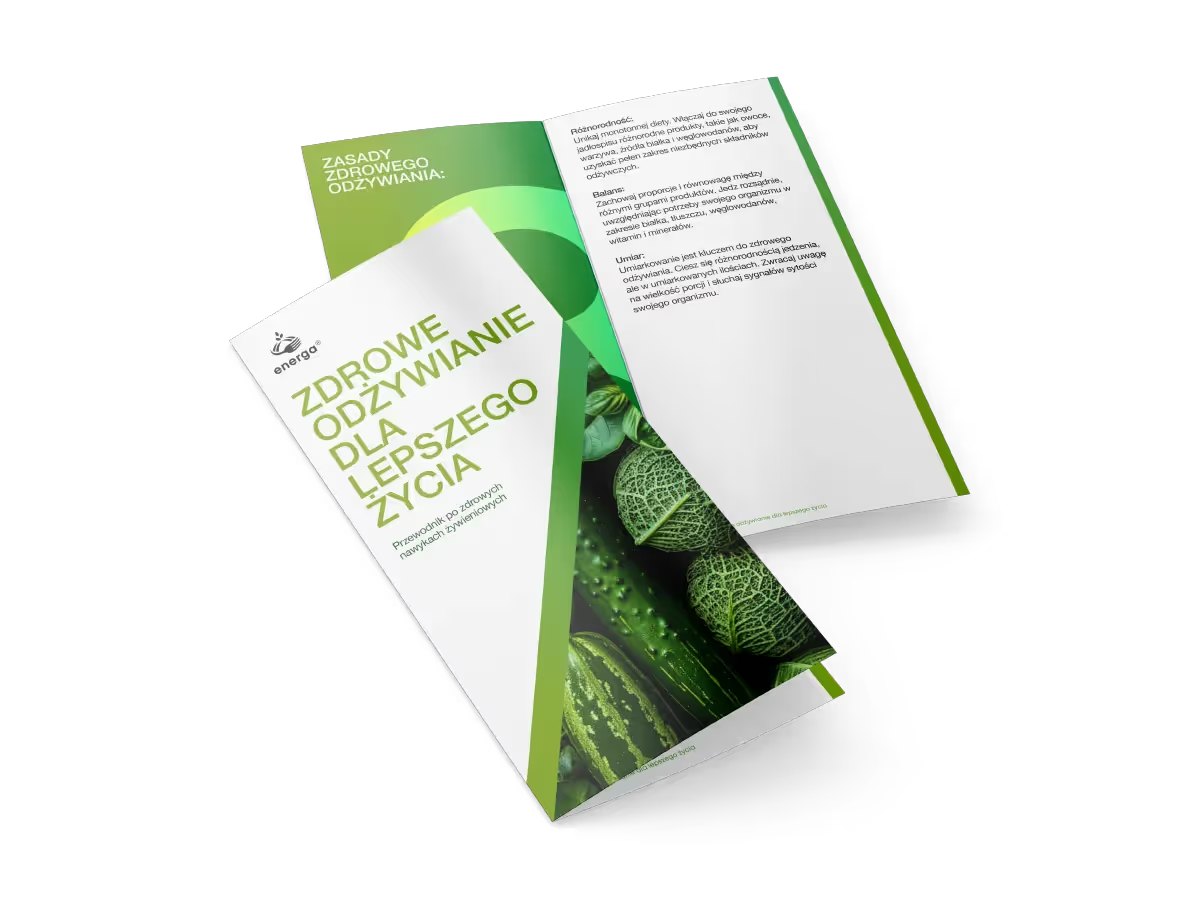
2. Folded Flyers (1 fold, 4 pages)
If you need more space for text while maintaining a convenient flyer size, a half-fold format is perfect. This option is great for presenting product offers, restaurant menus, or event programs. The center fold provides extra space for photos, graphics, or detailed descriptions, without disrupting the aesthetics of large images, creating an appealing and professional marketing material.
3. Tri-fold Flyers (2 folds, 6 pages)
Compact and versatile, tri-fold flyers are popular across various industries. With two folds, the content is divided into multiple sections, making information easier to digest. This format is frequently used for service presentations, user instructions, or city maps. Its small size allows for easy carrying in pockets or bags, increasing the likelihood of reaching potential clients.
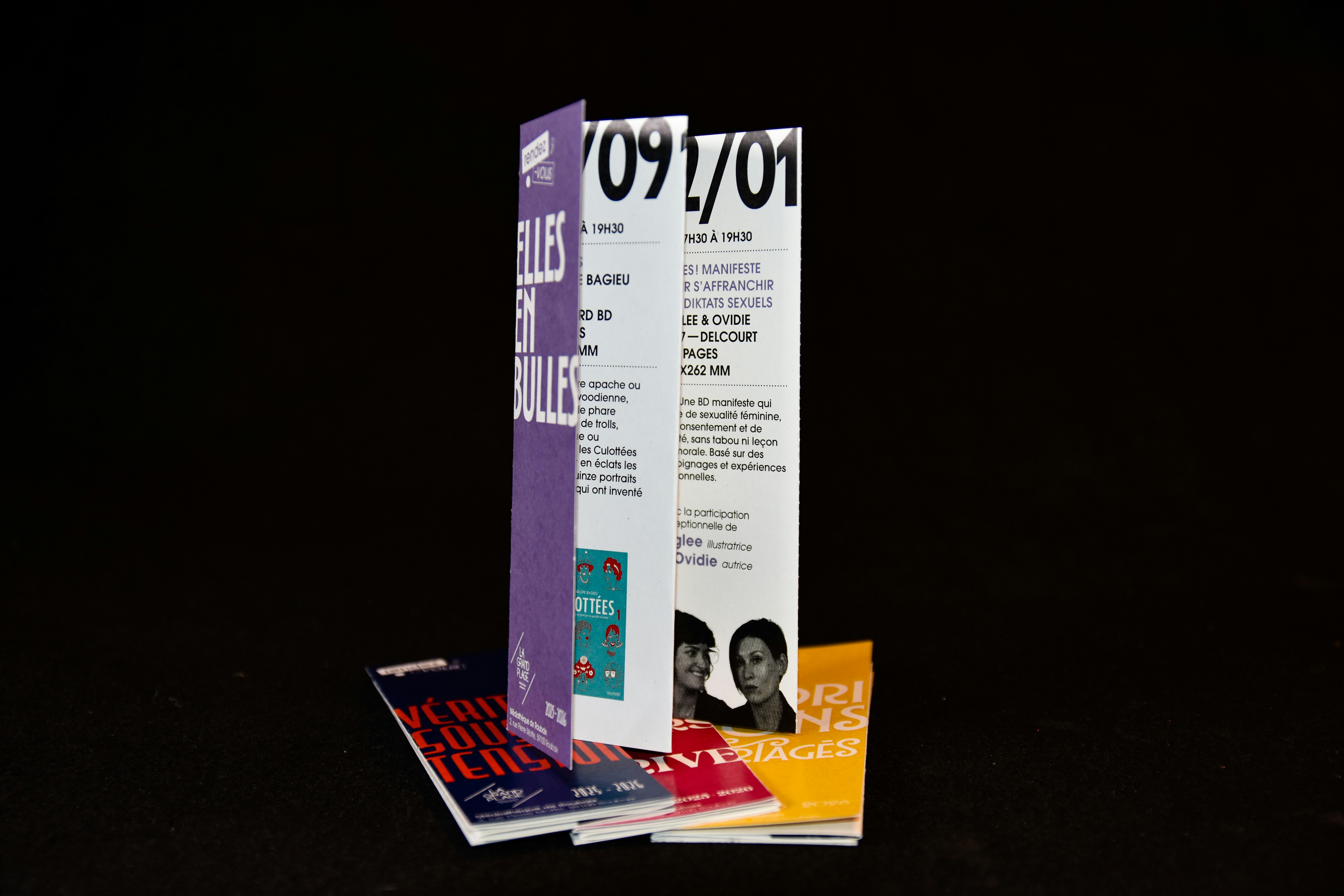
4. Accordion-fold Flyers (up to 6 folds)
For businesses with a broad range of products or services, accordion-fold flyers are ideal. This format allows for extensive information presentation while maintaining readability and visual appeal. Each section unfolds separately, facilitating content absorption without overwhelming the recipient. Perfect for extensive product catalogs, travel guides, or conference programs.
5. Window-fold Flyers (2 or 3 folds, 6 or 8 pages)
For a standout presentation, choose the unique window-fold format. This original design reveals information gradually, like window blinds opening, capturing potential clients' attention. Ensure the most important elements are centrally placed to be visible immediately upon opening. Window-fold flyers offer a creative and memorable way to present your offer.
Flyer Printing in Warsaw – Four Zeros: Your Partner in Achieving Success
At Four Zeros, we offer flyer printing on the highest quality paper using the latest technologies. Our team of experienced professionals will assist you in choosing the right format, paper, and finishing options to ensure your promotional flyers are an effective marketing tool. With our expertise, you can be confident that your marketing materials will look professional and capture the attention of potential clients.
When selecting flyer printing, consider the following factors:
- Price: The cost of printing flyers can vary depending on the print run, format, and type of paper.
- Paper Quality and Type: When placing an order, simply specify the folding type you're interested in, and our consultant will help you choose the appropriate paper and advise on the best execution.
- Turnaround Time: The production time for flyers depends on the print run and project complexity, but at Four Zeros, we prioritize every client's needs.
- Customer Service: Our specialists, technicians, and designers oversee every order, and you always have the opportunity to check the status of your order.
If you’re looking for a flyer printing company in Warsaw that guarantees high quality, timely delivery, and competitive prices, contact us today! We are confident that our flyers will help you succeed in your business, and our designers and technicians will ensure the highest level of service.
Znajdź więcej produktów, które pasują do Twoich potrzeb
Powiązane produkty
Flyers
Check our prices and see how easily you can reach a wide audience of potential customers by using high-quality promotional flyers.
from
20
zł
Our mission is to help you realise your ideas and achieve success.
You might also be interested in
A place where you will find plenty of inspiration and practical tips.
Printing for cafés and restaurants — what should you order?
Doloribus vel blanditiis non, aliquid deserunt reiciendis doloribus at vel error necessitatibus det.
In the food and hospitality business, taste matters. But long before a guest tries their first dish or takes a sip of coffee, they notice dozens of other details. The sign above the entrance, a restaurant menu, a seasonal offer card, a coaster, takeaway packaging or a business card included with the order — all of these elements shape how the brand is perceived.
That’s why printing for cafés and restaurants shouldn’t be treated as a collection of random materials ordered only when something runs out. Well-planned printed materials help create a consistent image for the venue, support sales and make the brand more memorable, even after the customer has left the restaurant. A consistent visual identity brings all these touchpoints together, turning them into parts of one recognisable system.
So, what is really worth ordering? Which materials are essential, and which can help boost sales or make your venue stand out from the competition? We’ve put together a practical list.
Menu — the most important printed material in a restaurant or café
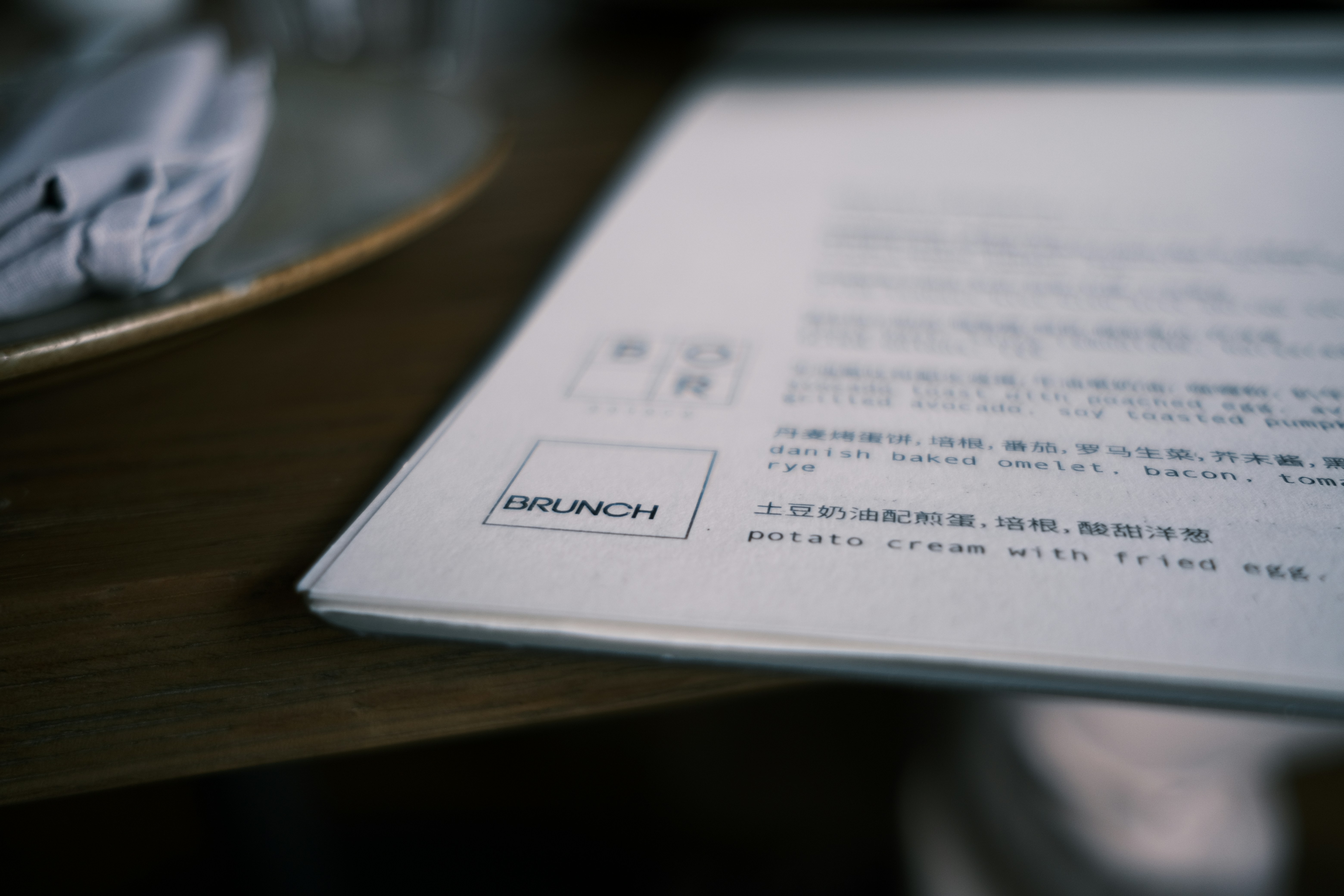
It’s hard to start with anything else. A menu is one of the printed materials that guests handle most often in any restaurant, café, bakery or bar. Customers may hold it for several minutes, comparing options, reading descriptions and using them to decide what to order.
That means that both a restaurant menu and a café menu need to be not only attractive, but above all, easy to read.
A font that is too small, insufficient spacing, a chaotic information hierarchy or an excess of decorative elements can make it harder for guests to choose. A well-thought-out design, on the other hand, helps them quickly find the categories they are looking for and draws attention to the items the place particularly wants to promote.
The way a menu is made should also depend on how it will be used. An elegant restaurant may need completely different paper and finishing than a small café that frequently changes its selection. If a menu is used intensively, durability should be a priority. If the offering changes several times a year, it’s important to be able to print updated versions easily and cost-effectively.
Professional menu printing should take into account not only the look of the design, but also how often it will be replaced, the conditions in which it will be used and the character of the restaurant or café.
It’s also good practice to order a few extra copies. Menus are used every day — they can get dirty, damaged or simply go missing.
Seasonal menus and add-on cards for the main menu
Not every change to the offering means redesigning and reprinting the entire menu.
In summer, you might add lemonades and cold brew; in autumn, pumpkin coffee; in winter, hot seasonal drinks and special desserts. For Valentine’s Day or other holidays, a restaurant may also prepare special sets. In situations like these, separate seasonal cards and add-on cards for the main menu work particularly well.
It’s a simple way to highlight a temporary offering without having to change the main menu.
A small card placed on the table can also act as an extra salesperson. A guest who wasn’t planning to order dessert may change their mind after seeing an attractive card featuring a new cheesecake, tiramisu or seasonal coffee.
That’s why it’s worth seeing these materials as more than just a way to provide information. Well-designed printed materials can actively support the sale of additional products.
Business cards — a small format that still makes sense
Do restaurants and cafés still need business cards? Absolutely, although their role has changed somewhat over time.
They no longer need to contain just an address and phone number. A business card can also serve as a small piece of promotional material that customers can take with them.
It can include opening hours, a website address, a social media handle or a QR code linking to a table reservation system, online menu or order form.
Another good idea is to use the back of the card to give customers a simple reason to come back. At the same time, there’s no need to cram too much information onto such a small card. The simpler the message, the more likely it is to be noticed and remembered.
Flyers for restaurants and cafés
Well-designed flyers can still effectively promote a local restaurant or café — as long as they have a clear purpose.
Simply printing a logo, address and a phrase like “You’re welcome” is usually not enough. Customers should immediately understand why they should keep the flyer or visit the restaurant.
A flyer can promote a lunch deal, delivery service, new menu, restaurant opening, catering, breakfast options or a special promotion.You can include flyers with takeaway orders, hand them out at local events or leave them in places where potential customers are likely to see them.
One particularly effective option is to include flyers with delivery orders. The customer is already familiar with the restaurant and has just placed an order, so there’s no need to convince them of the brand’s value from scratch. Instead, the flyer can encourage them to place another order, visit the restaurant or explore another part of what it has to offer.
Loyalty cards — a simple way to encourage customers to come back
Cafés are practically made for loyalty programmes. Customers buy coffee regularly, so a simple “buy a few, get the next one free” system is easy to understand and doesn’t require a complicated app.
A printed loyalty card has another advantage: it provides a physical reminder of the café. Seeing the card in their wallet may remind customers to come back.
There’s no need to limit this approach to coffee. The same idea can work well for a bakery, confectionery, ice cream shop or restaurant with regular lunch specials.
The card design should be simple. Customers should immediately understand how the programme works, know how many stamps they need to collect and what they will receive once the card is complete.
Coasters for cups and glasses
A coaster for coffee, a cocktail or a beer may seem like a small detail, but details like these help create a consistent image for a restaurant or café. Depending on the character of the restaurant or café, you might choose elegant coffee coasters or custom-printed beer coasters designed specifically for the brand.
They can feature a logo, a distinctive illustration, a short slogan or another element of the brand’s visual identity. This way, even an ordinary cup on the table becomes part of a carefully considered brand presentation.
Coasters also serve a practical purpose by protecting the table surface. In this way, they combine functionality with advertising.
However, there’s no need to turn them into miniature flyers and fill them with text. With such a small format, one strong graphic element is far more effective than several messages competing for attention.
Paper placemats
In restaurants and cafés that serve a large number of customers, paper placemats can also be a great option. They can protect the table surface, while their larger size offers many more possibilities.
They can feature a breakfast menu, lunch specials, the story behind the restaurant, interesting facts about the products or information about seasonal items.
In a family restaurant, a paper placemat could include a simple game for children; in a specialty coffee shop, a short introduction to the coffee’s origins; and in a restaurant serving regional cuisine, a few interesting facts about its ingredients and traditions.
The most effective printed materials for the food and hospitality industry often serve several purposes at once. Paper placemats can protect the table surface, reinforce the brand’s visual identity and act as a subtle form of advertising.
Stickers — one product, endless uses
Stickers are one of the most versatile types of printed materials in the food and hospitality industry.
They can be used to seal paper bags, label boxes, decorate cups, secure delivery packaging or add elements of the brand’s visual identity to simple, neutral packaging. This way, even an ordinary coffee cup with a logo or branded sticker becomes a recognisable part of the restaurant or café’s brand communication.
The latter option is particularly practical for small businesses. Instead of ordering large quantities of packaging specially made for the brand, they can use standard boxes, cups or bags and personalise them with a well-designed sticker.
A sticker can feature just the logo, but it doesn’t have to. You can create several versions — for example, “Thank you”, “Enjoy your meal”, “Baked today” or labels for individual products.
This makes it possible to give packaging a more distinctive, personalised feel at a relatively low cost.
Product labels
If a café or restaurant sells its own products — coffee beans, biscuits, fruit preserves, sauces, baked goods, tea blends or other items — it will also need well-designed labels.
These might include coffee labels, labels for tea packaging, sauce bottles, or jars of preserves and other products.
Here, aesthetics need to go hand in hand with functionality.
The label should suit the packaging and remain easy to read. It should also include all the information required for that particular type of product. That’s why you should decide on the packaging size and required information before creating the label design.
A cohesive series of labels can make even a small product range look like a fully developed brand.
Packaging and materials for takeaway orders
For many customers, their interaction with a restaurant now happens outside the restaurant itself. They order food for takeaway or delivery, buy coffee to go or take dessert home.
In these cases, packaging partly takes on the role that the interior plays inside the restaurant.
A bag, box, wrapper, sticker or add-on card can all shape the customer’s first impression when they receive their order. Consistent materials help the brand look professional even outside the restaurant.
It’s also worth thinking about what happens after the customer opens the package. A small thank-you card can include a QR code leading to the menu, social media profiles or a booking page. This is a natural opportunity to encourage the customer to interact with the brand again.
Vouchers and gift cards
A dinner for two, brunch, a tasting experience, a box of desserts or a set amount to spend at a restaurant can all make great gifts. That’s why it’s worth having printed vouchers ready to go.
A physical gift card looks much more appealing than simply sending a code in a message. It can be placed in an elegant envelope and given as a ready-made gift.
The design should reflect the character of the restaurant or café. For a premium restaurant, a minimalist design and high-quality paper can work well. A colourful cake shop, on the other hand, can use bolder, more expressive graphics.
It’s important to clearly state the terms of use and expiry date on the voucher, in line with the restaurant or café’s own policies.
Posters and promotional materials
New menu? Tasting night? Live music? A special weekend breakfast? A seasonal promotion?
Not every piece of information needs to go on the main menu. This is where posters, small information signs and other promotional materials can be useful.
They can be placed near the entrance, in the window, by the till or elsewhere in the restaurant or café. Their purpose is to communicate one key message quickly.
The key word is “one.”
A poster that people view from several metres away shouldn’t look like a newspaper page. A strong headline, the main information, the date and, if needed, the price or a call to action are usually enough.
QR code materials — connecting print with the online world
QR codes make it possible to connect traditional print with digital tools. They can be placed on menus, business cards, flyers, coasters, posters or packaging.
But the most important thing is where the QR code leads.
Simply writing “Scan the code” is not enough to motivate a customer to take out their phone. A specific message works much better: “View the latest menu”, “Book a table”, “Order online” or “See what’s new”.
Before printing, the code should always be tested on several devices. It’s also important to choose the right size and ensure sufficient contrast so that it can be scanned easily.
There’s one more practical rule: don’t use a QR code that leads to a page that will disappear in a few weeks. Printed materials are often used for much longer than originally planned.
Branded paper, envelopes and catering materials
A restaurant is about more than serving guests at tables. Restaurants that provide catering services or organise receptions, corporate events or weddings also need materials for professional communication.
An elegant proposal printed on branded paper, along with a matching envelope or document folder, can look much more professional than a random sheet printed on an office printer.
This is especially important for larger orders. If a client is planning an event for several dozen people, the way the proposal is presented also affects how they perceive the quality of the service.
Don’t order everything at once — start with what your business needs
There are plenty of options, but that doesn’t mean every café needs to order ten different products right away.
A small business focused mainly on takeaway coffee may need menus, stickers, loyalty cards, branded cups and packaging materials most of all. A full-service restaurant may focus on menus, seasonal add-on cards, vouchers and tabletop materials. A catering company will need a different set of materials altogether.
The best place to start is with a few simple questions:
– Which printed materials do customers interact with most often?
– Which of them influence their purchasing decisions?
– What does the customer take away with them?
– How often does the offering change?
– Which materials wear out quickly?
– Where could print be used to encourage the customer to make another purchase?
The answers will help you set priorities and avoid ordering materials that then sit in storage for months.
Consistency matters more than the number of materials
A menu can look great. So can a sticker. And a business card. The problem starts when each of these products looks as if it belongs to a different company.
Printed materials should form a consistent visual system. Consistent colours, typography, photography or illustration styles, logo usage and a similar tone of voice make the brand easier to recognise.
This doesn’t mean that every material has to look exactly the same. It’s about visual consistency and a carefully planned approach to restaurant branding.
A restaurant’s visual identity should cover more than just its logo and interior; it should also be reflected in its menus, packaging, promotional materials and all printed materials customers come into contact with. Likewise, a café’s visual identity should be visible on cups, loyalty cards, labels, coasters and materials used for takeaway orders.
Customers should be able to see a package, flyer or card and immediately associate it with the restaurant or café they have visited.
If the team prepares its own materials and is responsible for the brand’s communication, branding training can also be useful. It can show employees how to use individual elements of the visual identity consistently.
Print quality also shapes the customer experience
In the food and hospitality industry, the customer experience is made up of countless small details. A great dish served on a chipped plate loses some of its appeal. Likewise, an elegant interior doesn’t go well with a menu printed on cheap, unsuitable paper that quickly wears out.
That’s why, when choosing materials, it’s important to consider not only the design, but also the paper, weight, format, finishing and intended use of each product.
A menu used by hundreds of people every day requires one solution, while a voucher given as a gift may require something completely different.
Choosing the right printing method and materials can also help keep costs under control. The most expensive option isn’t always the best one. The best solution is the one that matches how the particular product will be used.
What should you order from a print shop for a café or restaurant?
There is no single, universal set of printed materials that works for every business in the food and hospitality industry. However, there are a few that can be useful for most restaurants and cafés: menus, seasonal cards, flyers, business cards, stickers, labels, tabletop materials, vouchers, posters and materials for takeaway orders.
The most important thing is that each one serves a clear purpose.
Print can provide information, support sales, keep the brand in customers’ minds, encourage them to come back or simply make the overall customer experience more thoughtful. It works best when all materials are planned as part of one visual identity rather than ordered separately whenever something runs out.
If you’re planning to open a new restaurant or café, updating its visual identity or simply organising the materials you use every day, start by making a list of the most important points where customers interact with your brand. This makes it much easier to decide what to print first, which format to choose and which materials can genuinely support sales.
At Four zeros, you can prepare printed materials tailored to the character of your café, restaurant or other food business — from essential printed materials to items that support promotion and create a consistent brand image. After all, good print in the food and hospitality industry shouldn’t be just an aesthetic addition. It should serve a clear purpose and do its job effectively.
Matte or gloss lamination — which should you choose?
Doloribus vel blanditiis non, aliquid deserunt reiciendis doloribus at vel error necessitatibus det.
In the world of print, details matter. They are what determine whether a product looks ordinary or creates a genuine "wow" effect. One of the most important finishing elements is lamination — often underestimated, yet one that has an enormous impact on how the final product is perceived.
The choice between matte and gloss lamination is not merely an aesthetic question. It is a strategic decision that affects brand image, the durability of the material, and the way in which a person interacts with the product.
In this article, we explain the differences between these two options, when each is best applied, and how to choose the right solution for your project — so that your printed material not only looks attractive, but works effectively.
What is lamination and why does it matter?
Lamination is the process of coating the surface of a printed material with a thin film — either matte or gloss. Its primary purpose is to protect the print from mechanical damage, moisture, and abrasion.
However, the protective function is only half the story.
Lamination also affects:
- the visual perception of the material
- colour saturation
- tactile feel
- the perceived quality of the product
In practice, this means that the same artwork can look entirely different depending on the type of lamination applied. Matte and gloss films produce two distinctly different final effects — and this is worth taking into account as early as the design phase.
Matte lamination — elegance and restraint
Matte lamination is the choice for those who value style, minimalism, and contemporary design. The surface is smooth, slightly satin in feel, and does not reflect light.
This option is particularly popular for premium materials.
Key characteristics:
- no glare or reflections
- muted, "soft" colours
- a pleasant, velvety texture
- an elegant, modern appearance
Where it works best:
- premium business cards
- high-quality catalogues and brochures
- invitations
- luxury packaging
- branded materials
Matte lamination conveys professionalism and a sense of calm. It is less visually aggressive, but more refined. Matte films are especially popular in contexts where the first tactile impression is important — the person literally feels the quality.
Worth bearing in mind:
- colours may appear less vibrant
- the surface may be more prone to fingerprints
Gloss lamination — vibrancy and visual impact
Gloss lamination works in the opposite way — it intensifies colours and draws the eye. The surface reflects light, making the print look more dynamic and expressive.
This is the ideal solution when a "wow" effect is required.
Key characteristics:
- strong, high-gloss sheen
- bright, saturated colours
- greater contrast
- a sense of depth
Where it works best:
- advertising flyers
- posters
- promotional materials
- magazine covers
- products aimed at a broad audience
Glossy lamination attracts more attention and has a more visually “bold” appearance.
Worth bearing in mind:
- reflections can make reading more difficult
- the surface feels more slippery to the touch
Matte or gloss — which is the better fit for your project?
There is no universal answer. The choice depends on several key factors.
Brand character
- premium, luxury, minimalist brand — matte
- dynamic, mass-market, sales-driven brand — gloss
Purpose of the material
- building brand image — matte
- attracting attention — gloss
Type of product
- business cards, invitations — more often matte
- flyers, posters — more often gloss
Conditions of use
- heavy, repeated handling — both options are viable, with durability as the priority
- strong ambient lighting — matte tends to be more legible
Can both effects be combined?
Yes — and this often yields the best result.
An increasingly popular approach is the combination of matte lamination with additional finishing techniques, such as:
- spot UV coating
- embossing
- foil stamping
The result? A matte surface with gloss accents = a contrast that draws attention and elevates the prestige of the project.
This approach is frequently used for:
- premium business cards
- exclusive packaging
- high-end marketing materials
The most common mistakes when choosing lamination
Focusing solely on price
A cheaper option does not always mean a better choice. Lamination is an element of brand image, not merely a technical detail.
Mismatching the lamination with the design
Not every design benefits from gloss. And not every design is enhanced by matte.
Ignoring conditions of use
A material that is handled frequently may look quite different after just a few days.
Skipping a test print
For larger print runs, it is worth ordering a proof or sample before committing to the full quantity.
How to make the right decision?
Practical advice
- consider what effect you wish to achieve — both emotionally and visually
- analyse where and how the material will be used
- match the lamination to your target audience
- consult with your print centre
- if in doubt — request samples
In practice, the best solution is not “which is better”, but “which is more suitable.”
Conclusion
Matte and gloss lamination are two distinct visual languages. One speaks quietly and elegantly; the other, loudly and dynamically.
The question is not which option is better. The question is which option better serves your purpose.
The right lamination can elevate a project to an entirely different level. The wrong choice can weaken even the strongest artwork.
If you want to be confident that your print will look exactly as it should, it is worth relying on experience.
At Four zeros, we help you choose not just the technology, but the final effect that truly makes a difference.
Four zeros — print you can see and feel.

The most common mistakes when preparing a file for print
Doloribus vel blanditiis non, aliquid deserunt reiciendis doloribus at vel error necessitatibus det.
File preparation is the moment where graphic design meets production reality. This is where the creative phase ends and technical precision begins. And it is precisely at this stage that errors most frequently occur — errors that can undermine even the most carefully crafted project.
At Four zeros, we regularly work with files prepared by clients — from simple business cards to complex advertising materials. And although many layouts look great on screen, after printing they sometimes turn out surprisingly different… unfortunately, not always in a good way.
In this article, we outline the most common mistakes made during print file preparation and explain how to avoid them, so that the final result looks exactly as intended.
1. Incorrect colour mode — RGB instead of CMYK
This is an absolute classic. The layout looks wonderful on the monitor — colours are vivid, rich, and contrasted. The problem appears the moment printing begins.
RGB is a colour space designed for screens. Print operates within the CMYK system. If the file has not been correctly prepared, colours can appear dull, less contrasted, or entirely different from what was originally intended.
A common question: should a print file be in CMYK or RGB? The answer is simple — always use CMYK. This applies to Photoshop, Illustrator, and any other graphics application.
The most common consequences:
– washed-out reds
– muted greens
– absence of rich, saturated blues
How to avoid this:
– always work in CMYK or convert the file before exporting
– verify colours before submission
– do not rely solely on how the design appears on screen
2. Missing bleed and safe margins
Bleed is the extra area of a design that extends beyond the trim line. Missing bleed is one of the most common causes of printing issues.
Without bleed, white edges may appear after trimming, and important design elements can accidentally be cut off.
The most common mistakes:
– the background ends exactly at the edge
– text is placed too close to the trim line
– safe margins are not included
How to avoid this:
– set bleed margins to 3–5 mm
– leave at least 5 mm of safe space for text and logos
– use ready-made templates provided by the print centre
3. Resolution that is too low
Images sourced from the internet very often lack the quality required for print. What looks sharp on screen can appear blurred and indistinct once printed.
The standard for print is 300 dpi at a 1:1 scale.
The most common consequences:
– pixelation of photographs
– loss of sharpness
– blurred details
How to avoid this:
– use high-quality graphics
– check the resolution before exporting
– do not scale up small images
4. Fonts not converted to outlines
Fonts are one of the most underestimated issues in print preparation. If the print centre does not have the required font installed, the system will automatically substitute it with another.
The result? A completely changed layout.
How to avoid this:
– convert all text to outlines before saving
– or include the font files, if the licence permits it
Converting fonts to outlines is particularly important when preparing files in Adobe Illustrator and Adobe Photoshop — it is a standard step prior to exporting the final PDF.
5. Incorrect file format
Not all file formats are suitable for print. JPG, PNG, and files created in office applications often fail to meet the technical requirements of professional printing.
The safest format is a PDF prepared specifically for print.
How to avoid this:
– export files as print-ready PDFs
– use the PDF/X standard
– avoid non-standard or unsuitable file formats
A print-ready PDF is the industry standard for flyers, business cards, and large-format production alike. PDF/X guarantees correct colour rendering, embedded fonts, and properly set bleeds.
6. Lines and elements that are too fine
Details that appear well-defined on screen may simply disappear after printing.
Lines thinner than 0.1 mm are often invisible or lose their definition entirely.
How to avoid this:
– use lines of at least 0.3 mm
– review the layout at 100% scale
– simplify very fine elements
7. Ignoring post-print finishing in design
If you plan to use spot varnish, embossing, or foil stamping, this must be considered already at the design stage.
Most common mistakes:
– missing separate layers for finishing elements
– incorrect file preparation for UV varnish
How to avoid this:
– consult the print centre during the project stage
– create separate masks for special effects
8. Skipping the final preflight check
Many errors can be identified before printing — provided someone actually checks the file.
Preflight is a technical review of the file prior to production.
How to avoid this:
– check the file in your graphics application or Adobe Acrobat
– review the layout at 100% scale
– ask the print centre to verify the file
9. Incorrect black colour settings
Black in print is not just one colour. Using only 100% K can result in a “washed-out” or greyish black.
For a deeper, richer black, use so-called rich black (for example: C60 M40 Y40 K100).
How to avoid this:
– use rich black for large solid areas
– use 100% K for body text and fine details
10. Lack of communication with the print centre
This is a mistake that occurs more often than one might expect. Each print centre may have its own technical requirements.
Failing to consult in advance often leads to revisions, delays, and additional costs.
How to avoid it:
– request technical specifications before starting work
– use the print centre’s provided templates
– consult the print centre for non-standard projects
How to prepare a print file — step by step
Whether you are preparing a file in Photoshop, Illustrator, or any other application, the process follows a similar sequence:
– set the colour mode to CMYK at the outset
– add bleeds (3–5 mm) and safe zones
– use graphics at a minimum resolution of 300 dpi
– convert all fonts to outlines
– export the final file as a print-ready PDF (PDF/X)
– perform a preflight check before submission
Preparing files for large-format print has its own specifics — the resolution may be lower (72–150 dpi at large scale), but bleeds and safe margins remain obligatory.
How to prepare a file for double-sided printing
Double-sided printing requires additional attention. Each side must be prepared as a separate page within the PDF, or as a separate file — depending on the requirements of the print centre.
Particularly important:
– keep identical margins and bleed on both sides
– account for binding or stapling space
– ensure proper alignment of elements on both sides
How to prepare a file for flyer printing
The flyer is one of the most popular advertising materials. When preparing one, special attention should be paid to:
– the correct format (A4, A5, DL, etc.)
– 3 mm bleeds
– safe margins of at least 5 mm
– CMYK colour mode
If a ready-made solution is needed, take a look at the flyer options at Four zeros and make use of the ready-made templates, which will help you prepare your file in line with all technical requirements.
Conclusion
Preparing a file for print is not merely an aesthetic exercise — it is, above all, a matter of technical precision. Even the finest design can suffer in quality if the file has not been prepared correctly.
The most common mistakes — incorrect colour mode, missing bleeds, or insufficient resolution — are easy to avoid once you know what to look for.
If you care about a result that truly impresses — it’s worth trusting professionals.
At Four zeros, we do more than simply print. We advise, review, and help refine every detail, so that the final product looks exactly as it should.
Four zeros — error-free printing starts with proper preparation.